
Our Analytics Platform
Back in March 2019, we released Firewall Analytics which provides insights into HTTP security events across all of Cloudflare's protection suite; Firewall rule matches, HTTP DDoS Attacks, Site Security Level which harnesses Cloudflare's threat intelligence, and more. It helps customers tailor their security configurations more effectively. The initial release was for Enterprise customers, however we believe that everyone should have access to powerful tools, not just large enterprises, and so in December 2019 we extended those same enterprise-level analytics to our Business and Pro customers.
Since then, we’ve built on top of our analytics platform; improved the usability, added more functionality and extended it to additional Cloudflare services in the form of Account Analytics, DNS Analytics, Load Balancing Analytics, Monitoring Analytics and more.
Our entire analytics platform harnesses the powerful GraphQL framework which is also available to customers that want to build, export and share their own custom reports and dashboards.
Extending Visibility From L7 To L3
Until recently, all of our dashboards were mostly HTTP-oriented and provided visibility into HTTP attributes such as the user agent, hosts, cached resources, etc. This is valuable to customers that use Cloudflare to protect and accelerate HTTP applications, mobile apps, or similar. We’re able to provide them visibility into the application layer (Layer 7 in the OSI model) because we proxy their traffic at L7.
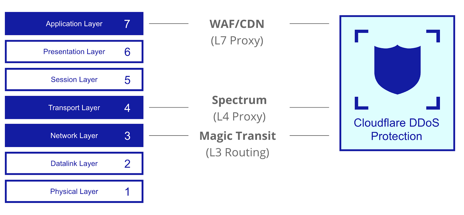
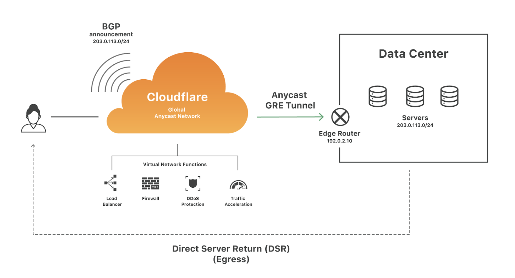
However with Magic Transit, we don’t proxy traffic at L7 but rather route it at L3 (network layer). Using BGP Anycast, customer traffic is routed to the closest point of presence of Cloudflare’s network edge where it is filtered by customer-defined network firewall rules and automatic DDoS mitigation systems. Clean traffic is then routed via dynamic GRE Anycast tunnels to the customer's data-centers. Routing at L3 means that we have limited visibility into the higher layers. So in order to provide Magic Transit customers visibility into traffic and attacks, we needed to extend our analytics platform to the packet-layer.
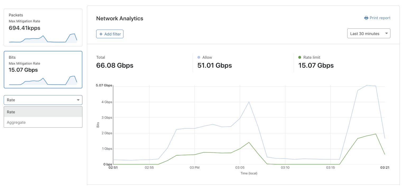
On January 16, 2020, we released the Network Analytics dashboard for Magic Transit customers and Bring Your Own IP (BYOIP) customers. This packet and bit oriented dashboard provides near real-time visibility into network- and transport-layer traffic patterns and DDoS attacks that are blocked at the Cloudflare edge in over 200 cities around the world.
Analytics For A Year
The way we've architected the analytics data-stores enables us to provide our customers one year's worth of insights. Traffic is sampled at the edge data-centers. From those samples we structure IP flow logs which are similar to SFlow and bucket one minute's worth of traffic, grouped by destination IP, port and protocol. IP flows includes multiple packet attributes such as TCP flags, source IPs and ports, Cloudflare data-center, etc. The source IP is considered PII data and is therefore only stored for 30 days, after which the source IPs are discarded and logs are rolled up into one hour groups, and then one day groups. The one hour roll-ups are stored for 6 months and the one day roll-ups for 1 year.
Similarly, attack logs are also stored efficiently. Attacks are stored as summaries with start/end timestamps, min/max/average/total bits and packets per second, attack type, action taken and more. A DDoS attack could easily consist of billions of packets which could impact performance due to the number of read/write calls to the data-store. By storing attacks as summary logs, we're able to overcome these challenges and therefore provide attack logs for up to 1 year back.
Network Analytics via GraphQL API
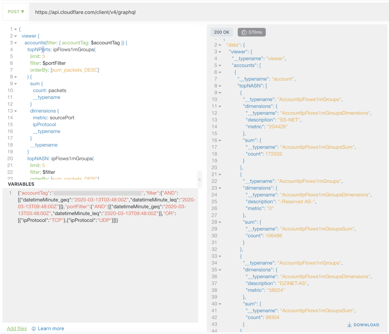
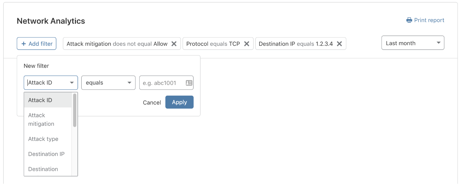
We built this dashboard on the same analytics platform, meaning that our packet-level analytics are also available by GraphQL. As an example, below is an attack report query that would show the top attacker IPs, the data-center cities and countries where the attack was observed, the IP version distribution, the ASNs that were used by the attackers and the ports. The query is done at the account level, meaning it would provide a report for all of your IP ranges. In order to narrow the report down to a specific destination IP or port range, you can simply add additional filters. The same filters also exist in the UI.
{
  viewer {
    accounts(filter: { accountTag: $accountTag }) {
      topNPorts: ipFlows1mGroups(
        limit: 5
        filter: $portFilter
        orderBy: [sum_packets_DESC]
      ) {
        sum {
          count: packets
          __typename
        }
        dimensions {
          metric: sourcePort
          ipProtocol
          __typename
        }
        __typename
      }
      topNASN: ipFlows1mGroups(
        limit: 5
        filter: $filter
        orderBy: [sum_packets_DESC]
      ) {
        sum {
          count: packets
          __typename
        }
        dimensions {
          metric: sourceIPAsn
          description: sourceIPASNDescription
          __typename
        }
        __typename
      }
      topNIPs: ipFlows1mGroups(
        limit: 5
        filter: $filter
        orderBy: [sum_packets_DESC]
      ) {
        sum {
          count: packets
          __typename
        }
        dimensions {
          metric: sourceIP
          __typename
        }
        __typename
      }
      topNColos: ipFlows1mGroups(
        limit: 10
        filter: $filter
        orderBy: [sum_packets_DESC]
      ) {
        sum {
          count: packets
          __typename
        }
        dimensions {
          metric: coloCity
          coloCode
          __typename
        }
        __typename
      }
      topNCountries: ipFlows1mGroups(
        limit: 10
        filter: $filter
        orderBy: [sum_packets_DESC]
      ) {
        sum {
          count: packets
          __typename
        }
        dimensions {
          metric: coloCountry
          __typename
        }
        __typename
      }
      topNIPVersions: ipFlows1mGroups(
        limit: 2
        filter: $filter
        orderBy: [sum_packets_DESC]
      ) {
        sum {
          count: packets
          __typename
        }
        dimensions {
          metric: ipVersion
          __typename
        }
        __typename
      }
      __typename
    }
    __typename
  }
}After running the query using Altair GraphQL Client, the response is returned in a JSON format:
What Do Customers Want?
As part of our product definition and design research stages, we interviewed internal customer-facing teams including Customer Support, Solution Engineering and more. I consider these stakeholders as super-user-aggregators because they're customer-facing teams and are constantly engaging and helping our users. After the internal research phase, we expanded externally to customers and prospects; particularly network and security engineers and leaders. We wanted to know how they expect the dashboard to fit in their work-flow, what are their use cases and how we can tailor the dashboard to their needs. Long story short, we identified two main use cases: Incident Response and Reporting. Let's go into each of these use cases in more detail.
Incident Response
I started off by asking them a simple question - "what do you do when you're paged?" We wanted to better understand their incident response process; specifically, how they’d expect to use this dashboard when responding to an incident and what are the metrics that matter to them to help them make quick calculated decisions.
You’ve Just Been Paged
Let’s say that you’re a security operations engineer. It’s Black Friday. You’re on call. You’ve just been paged. Traffic levels to one of your data-centers has exceeded a safe threshold. Boom. What do you do? Responding quickly and resolving the issue as soon as possible is key.
If your workflows are similar to our customers’, then your objective is to resolve the page as soon as possible. However, before you can resolve it, you need to determine if there is any action that you need to take. For instance, is this a legitimate rise in traffic from excited Black Friday shoppers, perhaps a new game release or maybe an attack that hasn’t been mitigated? Do you need to shift traffic to another data-center or are levels still stable? Our customers tell us that these are the metrics that matter the most:
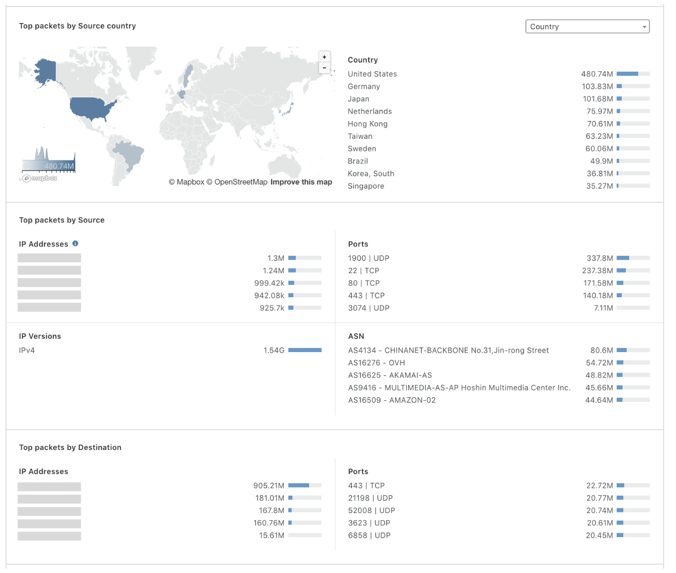
- Top Destination IP and port - helps understand what services are being impacted
- Top source IPs, port, ASN, data-center and data-center Country - helps identify the source of the traffic
- Real-time packet and bit rates - helps understand the traffic levels
- Protocol distribution - helps understand what type of traffic is abnormal
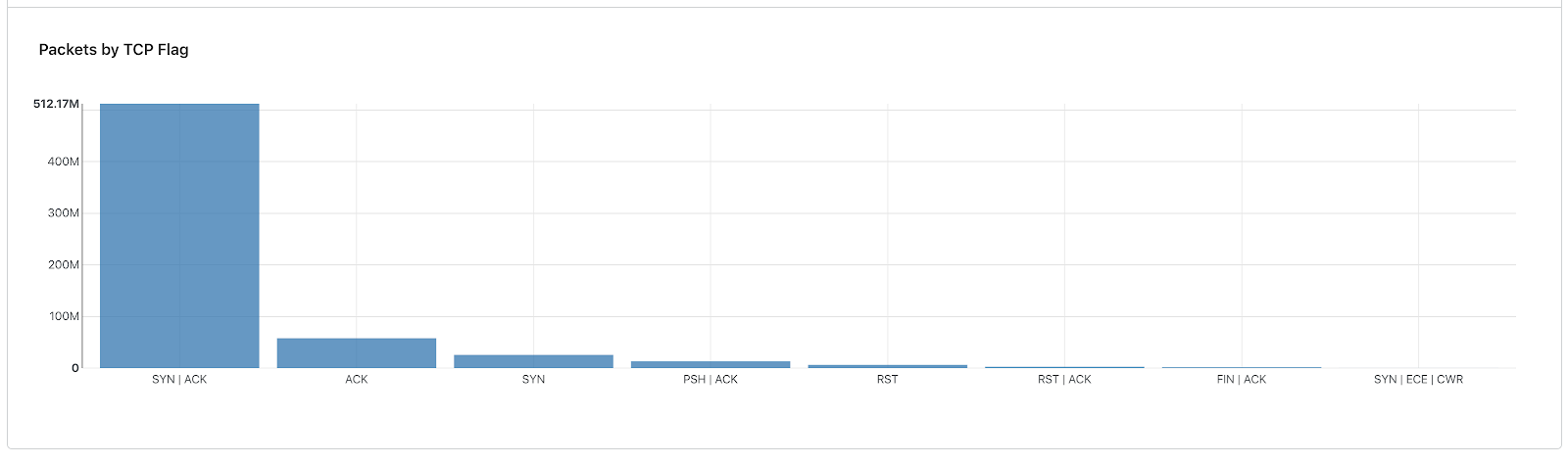
- TCP flag distribution - an abnormal distribution could indicate an attack
- Attack Log - shows what types of traffic is being dropped/rate-limited
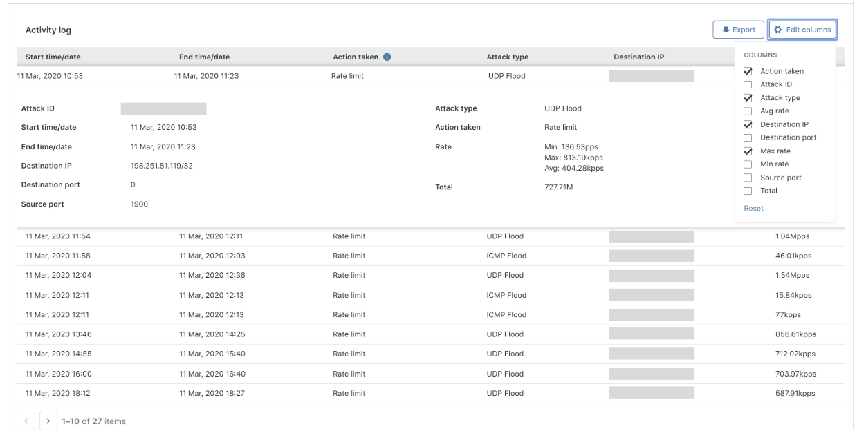
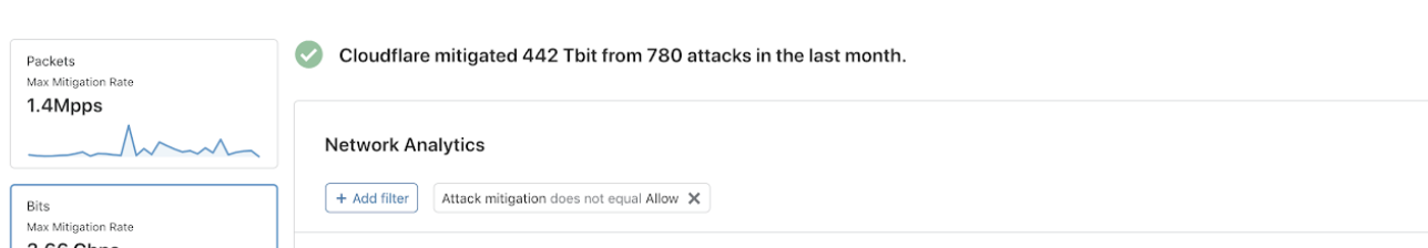
As network and transport layer attacks can be highly distributed and the packet attributes can be easily spoofed, it's usually not practical to block IPs. Instead, the dashboard enables you to quickly identify patterns such as an increased frequency of a specific TCP flag or increased traffic from a specific country. Identifying these patterns brings you one step closer to resolving the issue. After you’ve identified the patterns, packet-level filtering can be applied to drop or rate-limit the malicious traffic. If the attack was automatically mitigated by Cloudflare’s systems, you’ll be able to see it immediately along with the attack attributes in the activity log. By filtering by the Attack ID, the entire dashboard becomes your attack report.
Reporting
During our interviews with security and network engineers, we also asked them what metrics and insights they need when creating reports for their managers, C-levels, colleagues and providing evidence to law-enforcement agencies. After all, processing data and creating reports can consume over a third (36%) of a security team’s time (~3 hours a day) and is also one of the most frequent DDoS asks by our customers.
On top of all of these customizable insights, we wanted to also provide a one-line summary that would reflect your recent activity. The one-liner is dynamic and changes based on your activity. It tells you whether you're currently under attack, and how many attacks were blocked. If your CISO is asking for a security update, you can simply copy-paste it and convey the efficiency of the service:
Our customers say that they want to reflect the value of Cloudflare to their managers and peers:
- How much potential downtime and bandwidth did Cloudflare spare me?
- What are my top attacked IPs and ports?
- Where are the attacks coming from? What types and what are the trends?
The Secret To Creating Good Reports
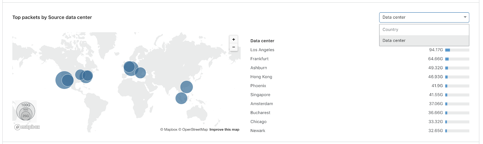
What does everyone love? Cool Maps! The key to a good report is adding a map; showing where the attack came from. But given that packet attributes can be easily spoofed, including the source IP, it won't do us any good to plot a map based on the locations of the source IPs. It would result in a spoofed source country and is therefore useless data. Instead, we decided to show the geographic distribution of packets and bits based on the Cloudflare data-center in which they were ingested. As opposed to legacy scrubbing center solutions with limited network infrastructures, Cloudflare has data-centers in more than 200 cities around the world. This enables us to provide precise geographic distribution with high confidence, making your reports accurate.
Tailored For You
One of the main challenges both our customers and we struggle with is how to process and generate actionable insights from all of the data points. This is especially critical when responding to an incident. Under this assumption, we built this dashboard with the purpose of speeding up your reporting and investigation processes. By tailoring it to your needs, we hope to make you more efficient and make the most out of Cloudflare’s services. Got any feedback or questions? Post them below in the comments section.
If you’re an existing Magic Transit or BYOIP customer, then the dashboard is already available to you. Not a customer yet? Click here to learn more.